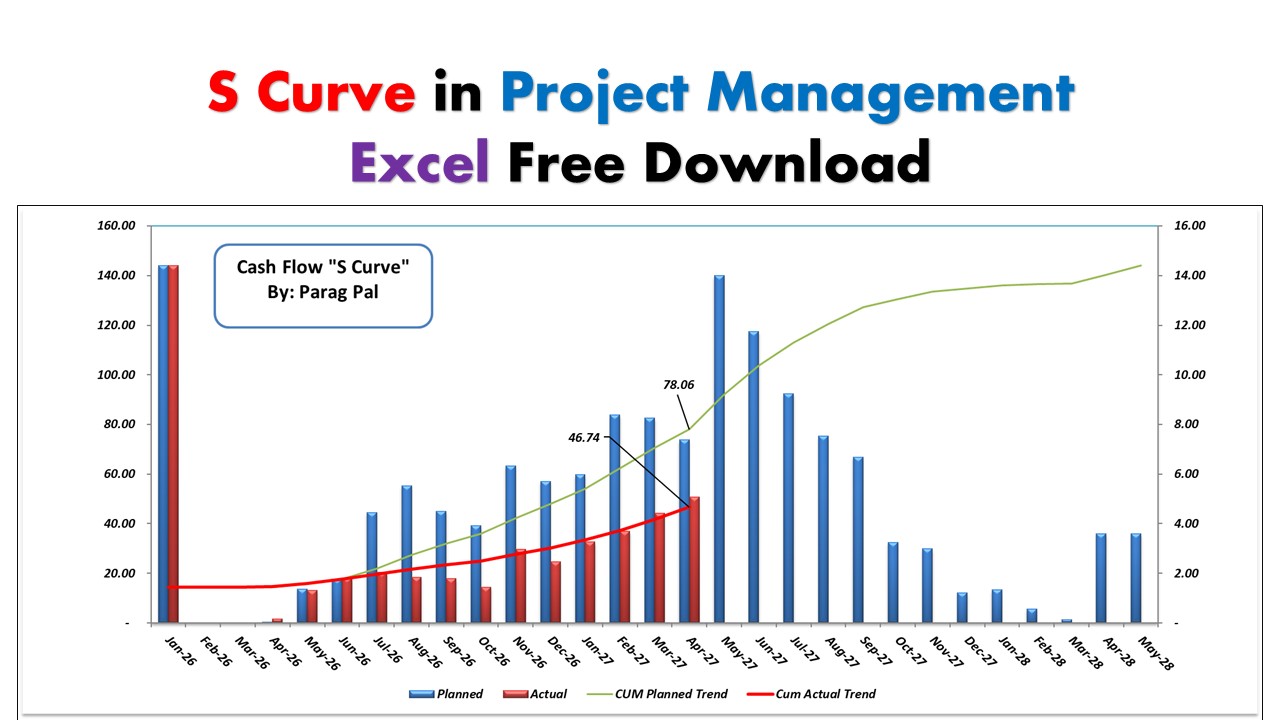
S curve In Project management
Let’s be honest: staring at a spreadsheet filled with thousands of rows of costs and dates doesn’t always tell you the full story.
You know the total budget. You know the final deadline. But if your client called you right now and asked, “Are we moving fast enough to hit that October deadline?”—could you answer them with 100% confidence just by looking at a list of numbers?
This process doesn’t works.
This is where the S-Curve comes in. It turns that wall of data into a single, simple line that tells you exactly where your project stands.
Here is a breakdown of why this graph is a lifesaver for project managers, plus a free Excel template so you don’t have to build one from scratch.
Wait, what exactly is an S-Curve?
It’s not as complicated as the textbooks make it sound.
An S-Curve is just a line graph that tracks your cumulative progress over time. We call it an “S-Curve” because most construction or engineering projects naturally follow an “S” shape:
- The Slow Start: At the beginning, the curve is flat. You are mobilizing, getting approvals, and setting up the site. Not much money is being spent yet.
- The Steep Rise: Suddenly, the work kicks in. The curve shoots up steeply. This is the middle of the project where everyone is working, materials are arriving, and the burn rate is high.
- The Flattening: As you near the end, things slow down again. You are just doing punch lists and handovers, so the line flattens out at the top.
Why you actually need this
It’s not just about making a report look pretty. The S-Curve is your early warning system.
When you plot your “Planned” line against your “Actual” line, the gap between them screams the truth:
- If your Actual line is below the Plan: You are lagging. You aren’t getting enough work done to meet the deadline. You need to add resources now, not next month.
- If your Actual line is above the Plan: You are moving faster than expected. This is usually great, but it’s also a check: are we burning through the budget too fast? Are we skipping quality checks?
Without this visual, you might not realize you are falling behind until it’s too late to fix it.
How to use the Excel Template
Building these charts in Excel from scratch can be a headache, especially getting the cumulative formulas right. So, I’ve put together a template that does the heavy lifting for you.
What’s inside the sheet:
- Plug-and-Play Data: Just enter your weekly planned costs/hours and your actuals.
- Auto-Calculations: The sheet automatically calculates the cumulative totals (the running sum).
- The Chart: The graph updates instantly as you type.
[Download the Free S-Curve Excel Template Here]
You can open this link in the google sheet from where you can download. Watch below video to understand in detail more about S curve in Project management.